At the recent SAP User group UK – Data Visualisation SIG I ran a hands on session based directly on the Stephen Few Dashboard Design Competition of late 2012 which was set to "showcase for the current state of expert dashboard design” (Full guidance, rules and specifications of this competition can be found at http://www.perceptualedge.com/blog/?p=1308).
My objective of this hands on session was to get the SIG attendees discussing a real life scenario in small groups and come up with an initial dashboard design in under one hour. I’m sure anyone who made an entry into the real competition (including myself) spent many more hours on their submission but I felt confident the attendees could encapsulate their thoughts in sketches, some being more legible than others, in a very short amount of time.
I was asked by Lars Schubert @graphomate via twitter to share the results, so here goes …


How do the SIG's sketches compare to the Competition Winners and Losers ?
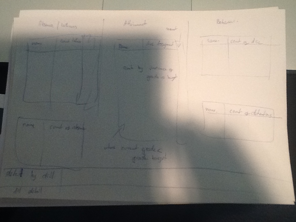
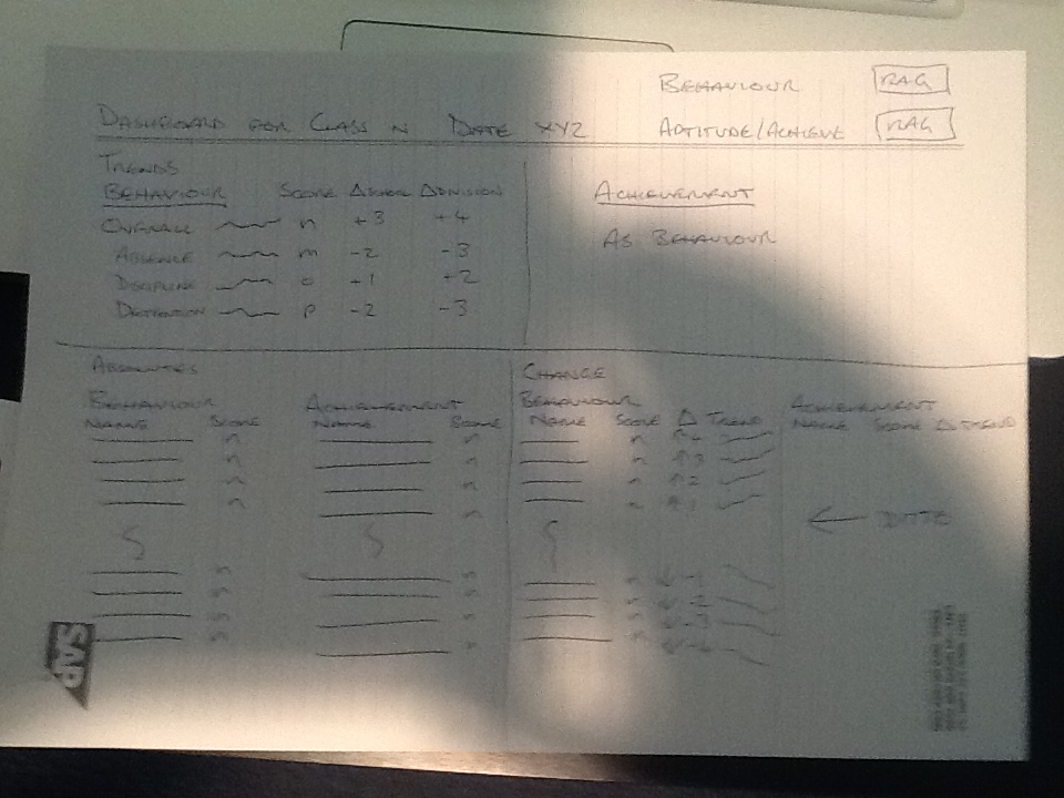
My official entry

The winner

The Runner Up

Stephen Few’s own solution

Observations from the designs
- Hopefully, you can see there is a lot of similarity in the designs,
- Data grids
- Common theme not easily readable in the photographs were Top 5 / Bottom 5 style visualisations to help drive the teacher in the scenario to the pupils that need attention that particular day/lesson
- Various types of graphs from Bar Charts, Sparklines and even a 3D Radar Chart
- Minimal text or commentary
- Distinct regions to group comparable components and data areas
- In the majority of cases interactivity was definitely part of the design
- “When you click here ….. ”
Group discussion
- Each sketch was explained to the whole group by the author and in the majority of cases it was said that the brief was not sufficient in the “real world” and they would have liked user engagement to gain greater understanding of the requirements.
- Honestly there was audible gasps when the competition winning design and Stephen Few’s own design were shown to the group. Both were so very far away from anything the attendees had designed themselves. Not one person in the room had remotely considered a layout that principally had one row per class member in a sorted list.
- There was another audiable reaction when the competitions "Runner Up" was shown, an attendee said out loud, "That's Better". Certainly a very emotional reaction, but the bigger question is WHY did was the "Runner Up" considered better then the Winner ? A topic for the next SIG meeting I feel!
- It was generally felt that both the competition winner and Stephen Few’s design had a place in a dashboard solution but they would
- be 2 to 3 levels down a drill path. It was widely agreed they both were missing a summary to clearly give the teacher in the scenario instruction not only of who they needed to focus on that day, but through predictive business rules indicate who is also at risk of falling behind in the focus areas
And one more thing …
Unbeknownst to me one of the Data Visualisation SIG attendees had spent a day attending a Stephen Few course on Table and Graph design in London a few days prior to this SIG. He had mentioned to Stephen that we were going to be using his competition as a hands on session and even offered for him to attend, Stephen declined explaining he was leaving the country before the day. PHEWWWWW
However, in their discussion my name was mentioned and over their lunch break Stephen dug out my entry and gave an impromptu critique of my design. The overriding theme I believe was that my design was “cluttered” and needed the teacher in the scenario to look around the dashboard to get a complete picture of a student. I have blogged about the thinking behind my design previously so I won’t explain my thinking here, if you’re interested take a look here http://wp.me/p248fQ-2w
It turns out in the discussion between Stephen and the SIG attendee it was mentioned that the competition scenario was based on a real use case and is was suggested that the teacher was a friend of Stephens and had asked for a one line per child design. If this is true then it would have been great if this was in outlined in the scenario briefing document, Ho Hummm
