- SAP Community
- Products and Technology
- Technology
- Technology Blogs by SAP
- Data Geek Entry: Adapting The SAP Lumira Visualiza...
- Subscribe to RSS Feed
- Mark as New
- Mark as Read
- Bookmark
- Subscribe
- Printer Friendly Page
- Report Inappropriate Content
The latest version of SAP Lumira supports HTML5 visualization extensions. This post is to give you a flavor of what I’ve found out about them so far (I’m using version SP11).
Since the personal edition of SAP Lumira is now free, don’t hesitate to download it, install it, and follow along.
Installing SAP Lumira Visualization Extensions
First, enable the extension samples by copying them to the right folder – follow the video or the steps below. You will need Administrator rights.
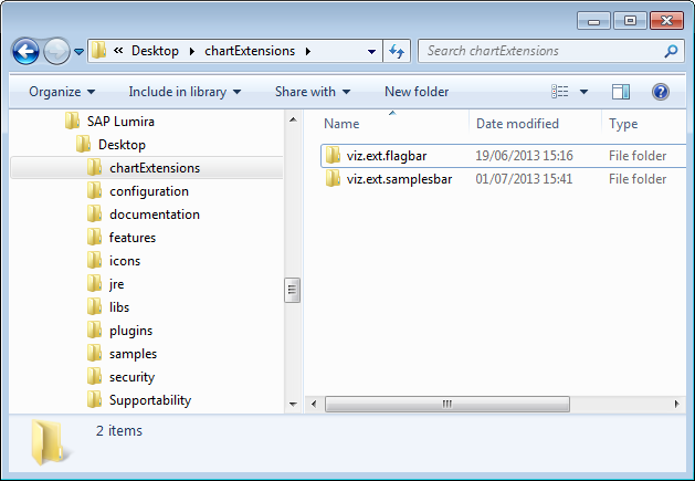
1. Go to the folder C:\Program Files\SAP Lumira\Desktop\samples (or equivalent), and copy the folder “chartExtensions”
2. Go to the folder C:\Program Files\SAP Lumira\Desktop\ and paste the folder you just copied.
A new “E” icon will be available in SAP Lumira next time it is launched:
Testing The Extensions
FlagBar Extension. First, let’s take a look at the Flagbar Extension.
Create a new document using data from the provided sample file:
C:\Program Files\SAP Lumira\Desktop\chartExtensions\viz.ext.flagbar\data\sampledata_flagbar.xls
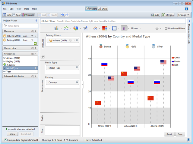
Use the “Enrich All” button to create measures. Click on the “Visualize” Tab, then click on the arrow by the “E” and choose “Flagbar Sample”
Drag the dimensions and measures “Country”, “Medal Type”, and “Athens (2004)” as shown:
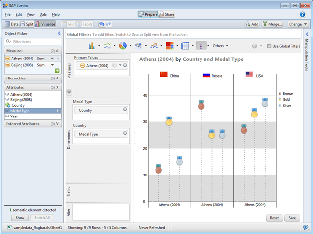
If you switch “Medal Type” and “Country” you’ll get this:
You can also change the Primary Values to “Beijing (2008)” – but that’s about it. It’s graphical, but not very flexible.
Sample Bar Chart Extension. The Sample Bar Chart Extension is more flexible, and a more useful basis for experimentation.
For some reason, a spreadsheet is not provided for the samplesbar sample. Here’s the file I’ll be using for the rest of this example: download sample excel file (note, figures completely made up).
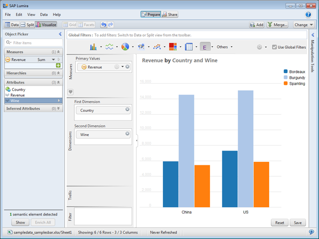
As before, create a new document, Enrich All, and go to the Visualize tab. This time, choose the “Sample Bar Chart” option, and drag the elements as shown below.
This samples works with any set of two-dimensional data. Save the visualization, and save the document, and close Lumira to start adapting these samples.
Adapting The Sample Bar Visualization Version 1
Let’s do something more interesting, and change the underlying code. The Visualization Extensions use the powerful, open source d3.js code, and there’s lots of tutorials available on the web on how to use it.
Unfortunately, debugging extensions are currently a little tricky. If you have access to the underlying SAP visualization libraries, you can do your coding and testing directly in a web browser, but without them, you have to launch Lumira each time, and it’s hard to know what the problem is. I trust this is something that will become easier in the future.
And before we start, yes, I know this these examples exhibit appallingly bad visualization practice. If you have a problem with that, I say “Bling it On!” (note, I published that post on April Fool’s Day).
The core code for the samplebar is in the file “viz.ext.samples.bar.viversion.js” located in the folder C:\Program Files\SAP Lumira\Desktop\chartExtensions\viz.ext.samplesbar\libs.
Open it up in an editor like Notepad++ (with Administrator rights, or you won’t be able to save it) and paste the code below on line 130, after the section “bars”.
//Add overlay image to each bar
groups.selectAll(‘image’)
.data(function(d, i) {return d})
.enter()
.append(‘image’)
.attr(‘xlink:xlink:href’, function(d, i) {return imagePath + dates[i] + ‘.png’;}) //’dates’ has the image values
.attr(‘preserveAspectRatio’, ‘none’)
.attr(‘width’, x2.rangeBand() + 1)
.attr(‘height’, h)
.attr(‘x’, function(d, i) {return x2.rangeBand() * i-1;})
.attr(‘y’, 0)
//mouseovers copied from bars above
.on(‘mouseover’, function(d, i) {
tip.showAt(this.parentNode, dates[i], d3.format(‘,.2f’)(d), {x:x2.rangeBand() * i + (x2.rangeBand() – 1)/2 , y:y(d)});
})
.on(‘mouseout’, function(d, i) {
tip.hide();
})
;
Alternatively, you can download and install the updated version of the file. I won’t go into all the details here (see the d3.js tutorials!) but basically, for each value, this code finds an image with the same name as the value in question and overlays it on top of the existing bars (don’t be confused by the fact that the variable is called “dates” – it just represents the variable shown in the bars/legend).
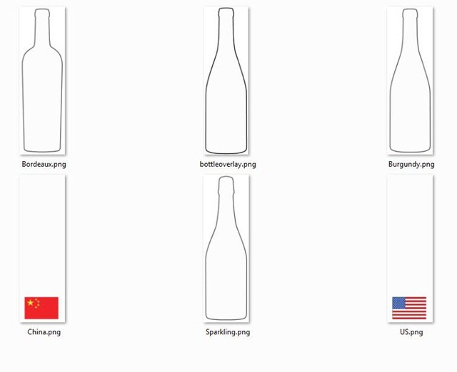
To complement the code, I created an image for each value (“Burgundy”, “China”, etc.) and stored them in a new folder C:\Program Files\SAP Lumira\Desktop\chartExtensions\viz.ext.samplesbar\images. Each image has a transparent section that lets through the color of the underlying bar — the “inside” of the bottle (the background is solid white), and the area around the flags.
You can download the images as a zipped folder – unzip it in the “vis.ext.samplebar” folder to create the “image” subfolder. Alternatively, you can just download a whole replacement samplesbar folder (save the old one somewhere, and rename this one by taking off the “_overlay”).
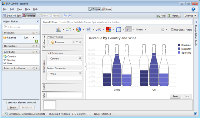
We can now relaunch Lumira and open up the same document as above. You should get something like the following (I also changed the color palette in this version):
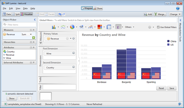
And if you swap the axes, you get the flags instead:
This version, while only a few extra lines of code, isn’t that flexible, and it’s hard to control the colors of the background. With some more code, we can be more ambitious.
Adapting The Sample Bar Visualization Version 2.
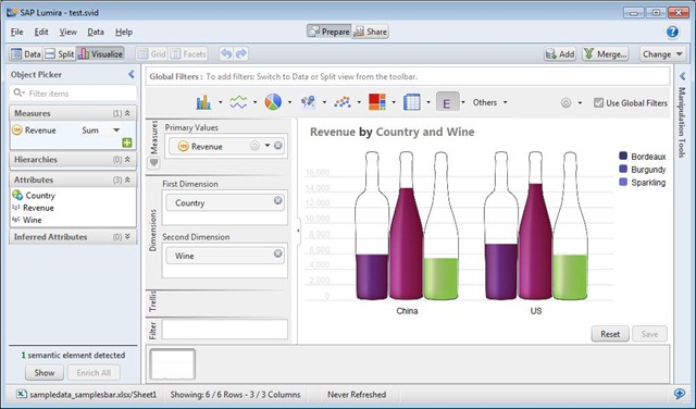
Download this version of the extension (again, copy the old samplebar folder somewhere, and delete the “_images” part to get this one to work), fire up Lumira again, using the same file, and you’ll get this:
This works in a similar way to Donald McCormack’s Old XProgressImage extension for SAP Dashboards (Xcelsius).
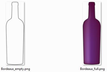
The code takes the value that is being charted, but instead of creating a bar, overlays an “empty” version of the picture, and then overlays that with a “full” version of the picture clipped to the right height. For example, here are the images for Burgundy – these images have transparent backgrounds outside the bottle:
This version of the extension will work for whatever values you choose, as long as there are equivalent empty and full pictures available.
It’s still a little limited, though — I haven’t done all the hard work that would be required to make sure that the sizing is appropriate – for example, if you have lots of bottles, you’ll end up with very tall skinny images. And like the original sample, it only works for two-dimensions-plus-a-measure.
I hope these samples were useful, and I look forward to seeing what others come up with!
[A version of this post first appeared on my Business Analytics blog. Follow me on Twitter for more!]
- SAP Managed Tags:
- SAP Lumira
You must be a registered user to add a comment. If you've already registered, sign in. Otherwise, register and sign in.
-
ABAP CDS Views - CDC (Change Data Capture)
2 -
AI
1 -
Analyze Workload Data
1 -
BTP
1 -
Business and IT Integration
2 -
Business application stu
1 -
Business Technology Platform
1 -
Business Trends
1,661 -
Business Trends
87 -
CAP
1 -
cf
1 -
Cloud Foundry
1 -
Confluent
1 -
Customer COE Basics and Fundamentals
1 -
Customer COE Latest and Greatest
3 -
Customer Data Browser app
1 -
Data Analysis Tool
1 -
data migration
1 -
data transfer
1 -
Datasphere
2 -
Event Information
1,400 -
Event Information
64 -
Expert
1 -
Expert Insights
178 -
Expert Insights
273 -
General
1 -
Google cloud
1 -
Google Next'24
1 -
Kafka
1 -
Life at SAP
784 -
Life at SAP
11 -
Migrate your Data App
1 -
MTA
1 -
Network Performance Analysis
1 -
NodeJS
1 -
PDF
1 -
POC
1 -
Product Updates
4,577 -
Product Updates
326 -
Replication Flow
1 -
RisewithSAP
1 -
SAP BTP
1 -
SAP BTP Cloud Foundry
1 -
SAP Cloud ALM
1 -
SAP Cloud Application Programming Model
1 -
SAP Datasphere
2 -
SAP S4HANA Cloud
1 -
SAP S4HANA Migration Cockpit
1 -
Technology Updates
6,886 -
Technology Updates
403 -
Workload Fluctuations
1
- Experiencing Embeddings with the First Baby Step in Technology Blogs by Members
- Product Updates for SAP Business Application Studio - March 2024 Edition in Technology Blogs by SAP
- TREX Revision Upgrade on Linux through shell script and Troubleshooting in Technology Blogs by Members
- Fast Track your AI Strategy with SAP Business AI in Technology Blogs by SAP
- Extending SAP Fiori elements the right way using standard processes in Technology Blogs by SAP
| User | Count |
|---|---|
| 12 | |
| 10 | |
| 10 | |
| 7 | |
| 7 | |
| 7 | |
| 6 | |
| 6 | |
| 5 | |
| 4 |
