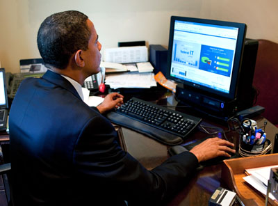
 Last month, Vivek Kundra (US Federal Government CIO) launched an IT Spending Dashboard providing an overview of the performance of Federal information technology investments.
The Dashboard site reveals IT spending across all major Federal agencies. It allows the public to interrogate budget and spending patterns across Government Departments using a variety of performance metrics. These include evaluating IT projects by Cost, Schedule and Overall rating (as provided by the Agency CIO).
Along, with this an interactive data feed page lets the public filter data by IT project, Category, and Department. This sliced dataset can provide a detailed spending snapshop which can then be exported as a CSV file or RSS feed. The ability to export this allows others to create mashups and web services based on this data.
This provision of open, machine readable data has been widely promoted by Vivek Kundra through the establishment of data.gov. This site, however, is based on the public creating visualisations and mashups of the data. This is in contrast to the new IT Dashboard, which visualises the Key Performance Indicators (KPIs) of different projects based on criteria such as cost and schedule.
The site also provides a rating of each major investment and currently nine agencies have finished rating 100% of the major investments. An example, of this is the Treasury's Enterprise Wide Content Management (ECM) Program. This has been rated as 2 (Moderately High Risk) by the Agency CIO and is currently on hold as the "Program lacks an agreed-upon implementation strategy."
This kind of transparency in relation to IT projects is commendable and subscribes to tenets of President Obama's Memorandum on Transparency and Open Government. The Dashboard promotes accountability and provides information for citizens about the kind of IT Projects, and their status, that are currently being funded. The release of this type of information allows the public to become more informed about the structure and status of their Government's IT expenditure.
Sunlight is the best disinfectant
The Dashboard has been well received by the public and members of Congress. It is seen as a useful means of providing greater transparency in the performance of multi-million dollar IT projects. There have been more than 20 million hits to the site so far, and the consequences of being transparent and open with data have now started to emerge.
Vivek Kundra announced on Friday that the Department of Veterans Affairs will be temporarily halting 45 IT projects, because they are either behind schedule or over budget. The combined budget for these projects is approximately $200 million and the worst offender was a program 110% over budget and 17 months behind schedule. These programs will now be evaluated to determine if they should be canceled or salvaged.
See more in the Interview from Federal News Radio.
Kundra attributes this investigation to the transparency enabled by the Dashboard:
"We were able to catch these contracts, in part, thanks to our new tool, the "IT Dashboard" which helped shed light on the performance of projects across the federal government."
While Kundra acknowledges the dashboard is not a substitute for good management, he believes the value comes from using it to make "evidence-based decisions on the future of IT investments". Providing easy access to historical performance data - in relation to contractor, agency, technology etc - enables improved fact-based decision making, especially to inform in IT budgeting and procurement negotiations.
Transparency 2.0
The use of dashboards and other visualisation tools by the US Government (see a list on Tim Elliott's blog), provides a marker for how organisations can benefit from being more open and transparent with data. Whether it's through an internal IT dashboard, or providing open data feeds, the consequences of enabling greater transparency and openness of internal KPIs can be immense.
The use of prediction markets (as employed by Cisco, P&G, Motorola etc), can be greatly improved if performance data is freely available and accessible within organisations. Questions such as "How many units of Product x will we sell in region y?", or "When will Project X go live?" can be answered more realistically if tools are in place to provide information on the current performance in these areas. Open data can provide a platform for greater reality-based decision making and improved forecasting throughout an organisation.
Future
The next site to demonstrate transparency 2.0 from the Federal Government will be the redesigned Recovery.gov. The contract for the site redesign was recently awarded to Smartronix, with the expectation that the site will go-live in October. Expectations for how the site will display stimulus spending are high, with many prototype dashboards demonstrating interesting data visualisation techniques.
While has been some criticism of the IT Dashboard - in it's use of colourful charts (created using Fusion Charts library) overshadowing the raw data - it is at least attempting to create an engaging experience for users.
The results of the Dashboard are already evident. Going forward it should enable the public to question Departments and Agencies more informatively in relation to their IT investments. This kind of accountability is necessary in many organisations to enable failing projects to be either cancelled or salvaged.
The success of Dashboards like this is not in their visualisations of data, but rather in the behaviours and actions they generate.
